

See? Super pretty!
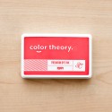
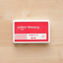
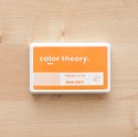
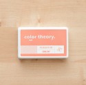
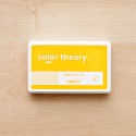
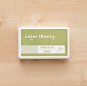
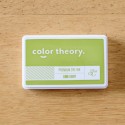
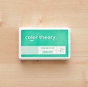
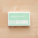
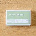
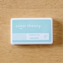
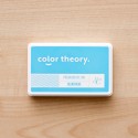
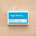
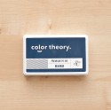
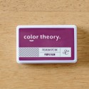
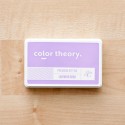
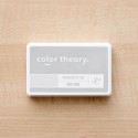
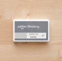
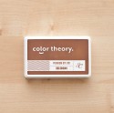
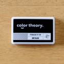
The last six colours to hit the streets are: Gray Area, Clear Blue, Creme Brulee, Lavender Soda, Poppy and Lemon Zest. Like on previous occasions I thought I would take it upon myself to give you a little insight into what they're like in real life.

And because it gives me a good excuse to put them through their paces for my own pleasure ;-)
To test out all the new colours what I did was stamp their names with my Kit Alpha Stamp (currently sold out, but the Ashley Goldberg Alpha would be a great alternative) which gives a nice crisp outline of the colour straight off the ink pad.
To colour them in I created a little waterpaint with each of the inks by first dabbing the pad onto an acrylic block so plenty of the ink got transferred. Then I used my waterbrush to dip into the colour and then paint onto my paper. A fun little technique that I use with these inks all the time, and it gives me a look at the different shades within the colour as well.

The colours are vibrant and bright and fabulous of course. I've definitely got my eye on Lemon Zest as my new favourite, although Clear Blue is pretty special too. But what I wanted to do next was see where these new additions fit in with the other 'older' colours in the same spectrum.

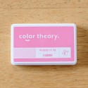
So here's the line up of how Poppy compares to Well Red and Flamingo. Each has been stamped twice after inking up to get a true colour, then progressively stamped off without re-inking (if that makes sense?) Now it's true that I've had to edit these photos a little because the light was a bit dark at the time, but I've tried to get the white paper as normal as possible in order to give you a true representation of the colours. It really is quite difficult to tell much of a difference between Poppy and Well Red even in real life but you'll have to trust me that there is! Well Red is a touch deeper and darker, whilst Poppy lives up to it's name as a brighter poppy colour.

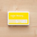
It's much easier to see that Lemon Zest sits somewhere in between Sunny Day and Orange County and is a lovely egg yolk custardy colour (yes I get hungry a lot now that I'm pregnant, and food comparisons rate high on my interests lately!)

And this is how Gray Area and Creme Brulee fit into the more neutral tones. Certainly Gray Area is much lighter and warmer than Clean Slate and would make a great shadow colour.
Clear Blue and Lavender Soda are also both lighter tones of colours that have gone before them and you can see the comparison here.
So now that the collection is complete, which do you already have? What's on your list of what to get next? And what are you going to use them for? Link me up 'cos I'd love to see!!

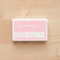
All the pretty colours:
0 comments
Post a Comment
Thanks for visiting my blog today. Come back again soon :-)